How EQ3 Can Make Modern Feel Close to Home
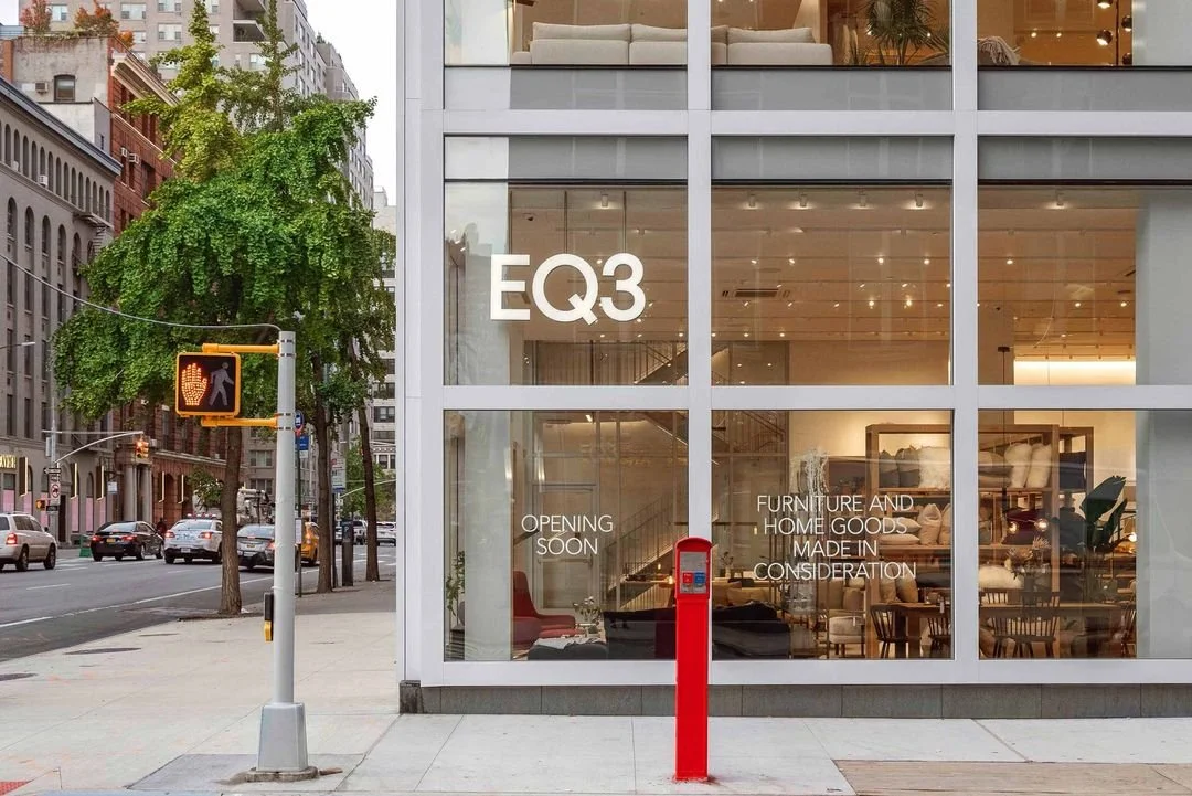
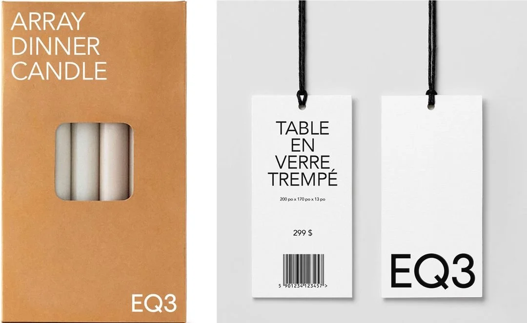
EQ3’s 2020 rebrand collaboration with Wedge Studio marked a defining moment in Canadian design. Once defined by its minimalist furniture and homegrown sensibility, the brand evolved with a new visual and strategic expression — one that positions EQ3 not just as a design retailer, but as a design voice.
What’s always drawn me to EQ3 is its quiet confidence — the belief that good design doesn’t have to shout to be felt. It’s modern, but never cold; intentional, but never inaccessible.
That balance between refinement and warmth feels deeply human, and it’s inspiring. I’ve been reflecting on how that same sense of warmth can continue to come through in every touchpoint. This reflection is both an appreciation and a personal exploration of how EQ3 can keep making modern feel like home.


A Philosophy Waiting to Be Felt
The phrase “Emotional Quotient in the Third Dimension” beautifully captures what EQ3 stands for: spaces that move us. However, when set against the brand’s marketing touchpoints today, a quiet tension emerges between what EQ3 says it values and how those values come to life.
In Wedge’s articulation, EQ3 isn’t just a furniture maker; it’s a custodian of feeling. The visual and verbal foundation — clean typography, thoughtful tone, and emotion-first narrative — gives the brand clarity and confidence.
Yet, on EQ3’s marketing touchpoints, much of that emotional framing fades into the background. The website still functions primarily as a retail catalogue: transactional, efficient, but somewhat detached.
EQ3’s marketing emails reveal a consistent tone—clean visuals, minimal design, but noticeably transactional in language. Phrases like “Save up to 50%,” “custom solutions,” and “exclusive access” focus on selling rather than storytelling.
The brand’s emotional promise rarely translates into how a visitor feels while exploring the site. The EQ3 story is present in words but buried deep in the pages. This creates a strategic gap between identity and implementation — and it’s where brand experience design can add the most value.
Example: The current Canadian Made page on EQ3’s website features a single craftsman assembling a sofa frame. While it nods to local production, the storytelling feels understated — missing the collective spirit, landscapes, and emotional warmth that make EQ3’s Canadian identity distinctive.
The Opportunity: From Simplicity to Specificity
EQ3’s minimalist visual language works; it signals refinement and calm. But minimalism alone doesn’t make a brand timeless; specificity does.
Right now, the website reads as a showroom more than a home. The whitespace is elegant, but it leaves little room for warmth. It communicates control, but not care — order, but not life. The result is a digital experience that feels polished, yet distant — a brand that looks thoughtful but doesn’t feel it.
Canadian design is not Scandinavian minimalism or American modernism; it’s its own kind of warmth — rooted in community, material honesty, and quiet optimism. To embody this distinctly Canadian ethos digitally and physically, EQ3 could:
Bring warmth to minimalism. Use motion, texture, and human voice for minimalism that feels lived-in, not sterile.
Tell richer design stories. Bring Canadian makers, studios, and collaborators whose work expresses the EQ3 values in form and function to the forefront of EQ3’s narrative.
Reimagine digital relationship-building. Shift from transactional moments to relationship-led experiences. Design guided journeys that help visitors connect emotionally before they convert.
Anchor visuals in locality. Let colour palettes, photography, and tone reflect the hues of Canadian nature — the prairies, the diffused northern light, the tactility of natural materials.
The goal isn’t to add clutter; it’s to add character. To make EQ3’s digital world feel like the homes it helps create: thoughtful, grounded, and timeless.
Tweaking EQ3’s existing homepage
Refreshing EQ3 website, for me, starts by softening the edges — bringing back the warmth, tactility, and quiet humanity that define the brand at its best. The goal wouldn’t be to redesign for novelty, but to make the experience feel more lived-in: gentle movement, thoughtful messaging, and warm imagery that shows how design meets everyday life.
It’s important to note that this is only one step. A homepage can set the mood, not carry the message alone. For EQ3 to fully embody its philosophy, that emotional warmth has to echo across every touchpoint: in complimentary design services, in how customer care conversations sound, even in the follow-up emails after a purchase.
Here’s how I’d approach the EQ3 homepage:
Before and After: EQ3 Homepage Refresh by Aqil Raharjo
Changes to warm the heart
EQ3’s brand already speaks the language of care — calm, crafted, and distinctly Canadian. What’s missing is how that care feels in practice. The digital experience could invite more warmth, tactility, and life. Small, intentional design shifts (in tone, imagery, and rhythm) can turn clarity into comfort, making the site feel less like a catalogue and more like a home. Here are the key changes of the website:
The old hero was elegant but sterile — all order, no intimacy. The update brings warmth; now it feels like a home, not a showroom.
“A Little Thank You, From Us to You” spoke in a retail cadence; polite but impersonal. “Bring Conscious Living Home Today” still highlights urgency, but also emphasizes relationship, not transaction. The shift is subtle but strategic: EQ3 now sounds like a brand that wants to connect, not just sell.
The headline now reads as relational (“From our hands to your home, Canadian by Design™”). The tone invites rather than instructs.
The new iteration reframes design as collaboration, positioning the customer as co-creator rather than consumer.
Hand-drawn illustrations reappear, adding softness and character to the digital experience; a subtle reminder that EQ3 design is human-made, not machine-perfect.
Before, financing copy read as purely transactional. The new phrasing, “Take your time. Pay over time.” speaks to an acknowledgment that design is an investment in both comfort and life.
The new imagery of people in conversation, surrounded by swatches and samples, feels intimate and real. It invites co-creation, mirroring the tone of an in-store design dialogue; not an upsell, but a partnership.
“Choose with Confidence” reinforced function: order swatches, test materials. It focused on eliminating risk, a product-first mentality. “See it. Feel it.” shifts the focus from transaction to sensation.
The existing “Canadian by Design” section misses an opportunity to tell a deeper story. While the image of a single person suggests personality, it doesn’t reflect the many hands, perspectives, and landscapes that shape each product. By pairing stories of Canadian landscapes and makers, the blog aims to root the brand in authenticity and Canadian values — reminding visitors that EQ3 isn’t just designing furniture, but designing the feeling of home.
Through these changes, Canadian, by Design™ becomes more than a tagline; it becomes a sensory language. This is about keeping the aesthetic restraint, but infusing it with emotional and cultural dimension. These human moments transform EQ3 from a furniture retailer into a partner in design.
Closing Thought: The Next Touch of EQ3
EQ3 has built the walls and framed the story. What’s left is to make it feel lived in — to fill its spaces with warmth, texture, and life. When the brand feels as welcoming as the homes it helps create, Canadian by design becomes something deeper: Canadian by heart.


