
Why the CQCC Rebrand Missed Its Strategic Moment

Love the Word, Not the Work
Lessons from the CQCC Rebrand
“Queer” is powerful. It’s expansive, fluid, and affirming — a word that has reclaimed space for so many of us.
When Canada’s 2SLGBTQI+ Chamber of Commerce announced its new identity, the Canadian Queer Chamber of Commerce (CQCC), it felt like a celebratory moment. A long-overdue linguistic shift toward inclusivity. It signals a commitment to inclusion, fluidity, and reclamation; values that matter deeply in today’s social and business context.
But the strength of a rebrand lies not just in the word itself, but in how it’s carried through naming, storytelling, and visual expression.
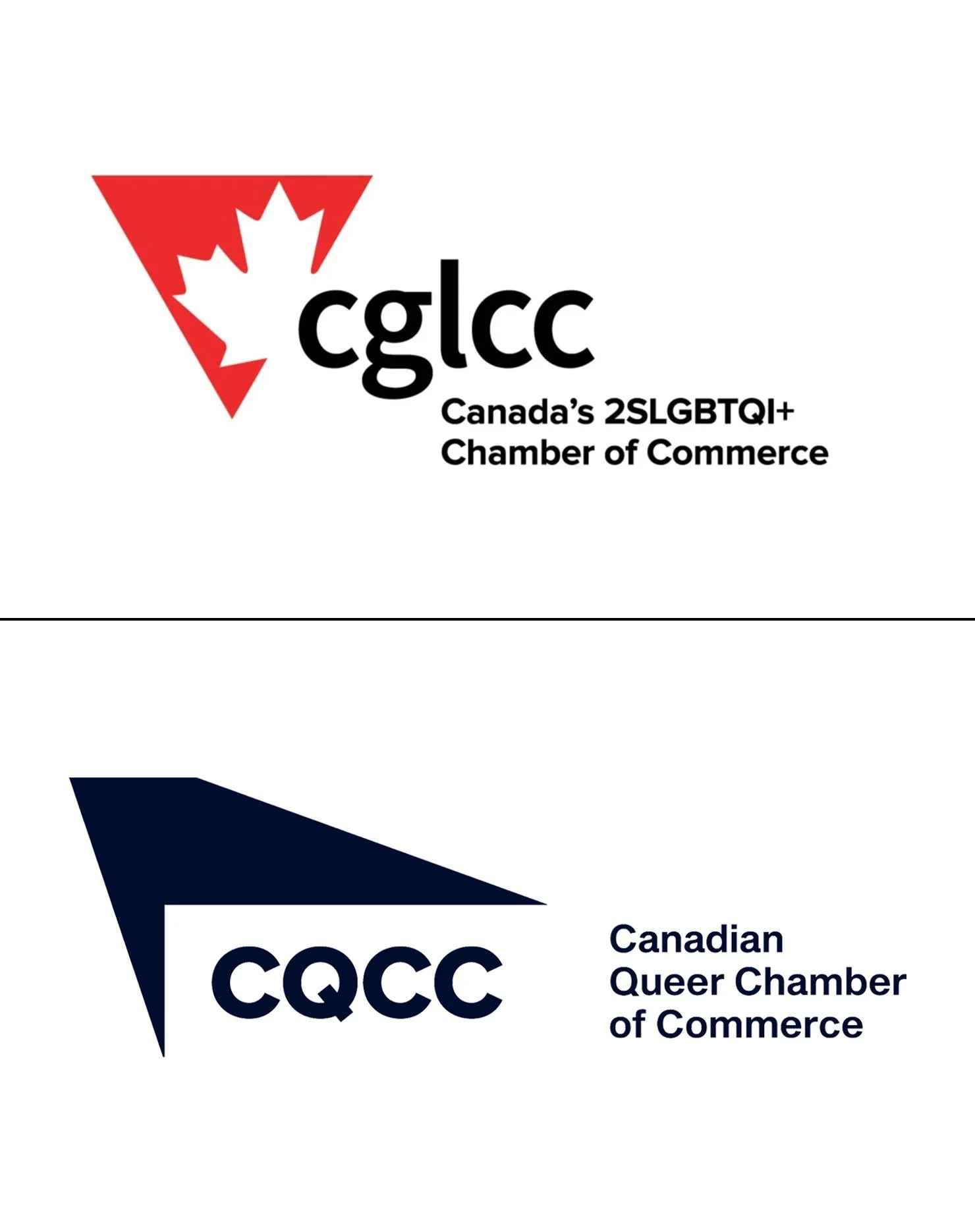
The shift that feels stark
The previous logo’s maple leaf and triangle rooted it in both national identity and queer history, turning a painful past into a mark of pride. Its lowercase wordmark carried approachability and ease.
By contrast, the new CQCC logo moves toward rigidity. Its condensed, uppercase typography and dominant form create a visual imbalance. The result feels commanding, but not connected; a confident visual that’s lost its story.


A name that doesn’t quite sing
As a designer who’s passionate about how words, visuals, and systems shape belonging, I couldn’t help but pause. I can’t help but feel this was a missed opportunity to build something even bolder; something that sings when you say it out loud. Because “Queer” is the right word, but great branding requires more than just the right word.
A name like Queer Canadian Chamber of Commerce (or QC3) would’ve rolled off the tongue with clarity and pride. It has rhythm, recall, and a built-in sense of belonging. Even at the launch event, key speakers seemed to hesitate when introducing the new name — a small but telling sign of a brand still searching for its voice.
The intent is strong: to broaden the tent and make more entrepreneurs feel seen. But intent alone doesn’t equal strategy. The rebrand feels rushed; a name change without the storytelling architecture to support it.


A brand that speaks, but doesn’t say much
As someone who lives and works at the intersection of design and identity, I find the current visual identity, while vibrant, to be largely decorative; a surface-level symbol that doesn’t convey deeper meaning.
The sharp edges of the new logo certainly project confidence and boldness, yet they don’t feel particularly welcoming. The form almost recalls the tail end of a plane — sleek, but distant — and doesn’t reflect the warmth or community spirit I associate with the organization. The lack of any clear Canadian symbolism is also disheartening. For a brand meant to represent national pride and inclusivity, the design feels impersonal and unfinished.
Typography further complicates things. The tight kerning makes the text difficult to read, especially at smaller sizes, and pairing dark blue with black only worsens legibility. The low contrast not only poses accessibility challenges for those with visual impairments but also makes the design harder to engage with in everyday use.
Even the color palette feels unresolved; loud, yet lacking resonance. Without a clear primary color to ground the identity, the brand risks feeling directionless, leaving audiences unsure which hue represents them.

None of this is to take away from the effort or intent behind the change.
I genuinely celebrate the courage it takes to evolve publicly. But inclusive design demands more than linguistic updates; it asks for soul, nuance, and the kind of thinking that makes every queer entrepreneur feel seen and spoken for.
The next chapter of belonging
Inclusive branding isn’t just about language; it’s about building a system of meaning. When done well, every design choice, from naming to logo to narrative, extends the feeling of belonging it’s meant to signal.
Design can be a mirror or a bridge, and right now this one feels more like a mirror of corporate polish than a bridge to community pride. My hope is that the next chapter brings the empathy, symbolism, and soul that this moment deserves.